
|
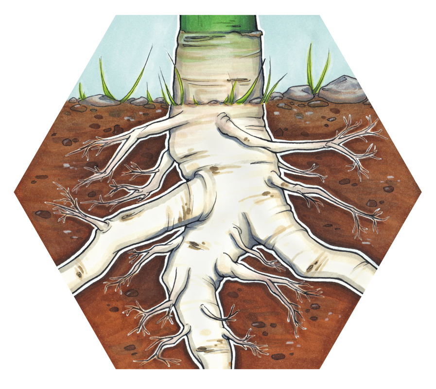
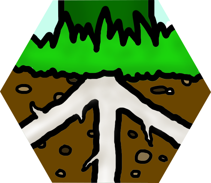
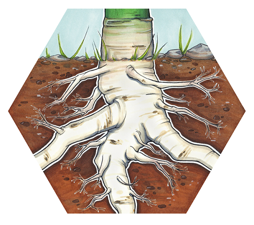
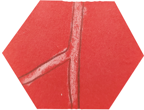
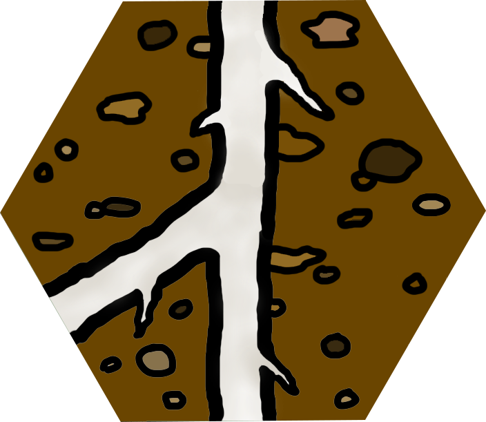
Having introduced Marlies Draaisma as the illustrator who is working on the art for Fruit, I thought it would be fun to take a look at how the designs for the tiles have evolved. The very first iterations of the tiles started out as pencil and crayon sketches on hexagons of coloured paper, some of which were drawn by my daughter; these were fine for my early play tests in which I played against myself to set the first versions of the rules, but they were clearly very crude. I drew the next versions using Photoshop, and although they're a bit neater than the original physical sketches, they're still pretty basic...but they were perfectly serviceable for some expanded play testing with friends and strangers. I was OK with them functionally, but it was really important to me that the final tiles had an extremely strong aesthetic. And then we have the final versions by Marlies. These are just gorgeous, and although play testing is still ongoing, the core tiles won't change - so these are more or less how the game will look when it's finished and free in the wild. Anyway, let's take a look at how they've evolved: The Starter tile
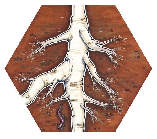
The Root tile
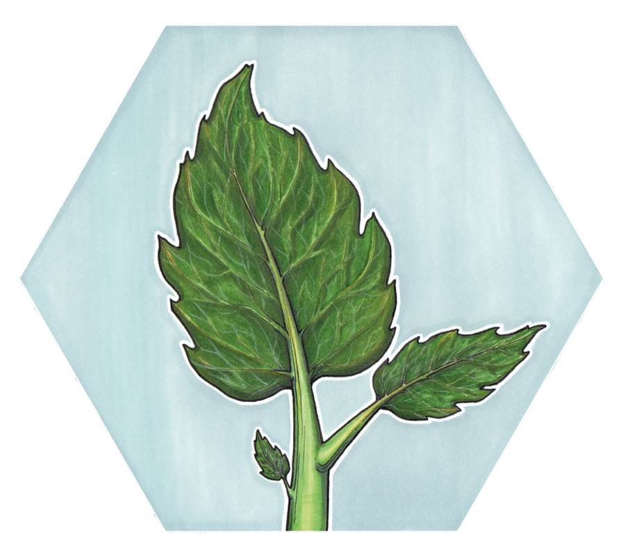
The Leaf tile
I've been working on the game for a while now, and as development is iterative and a lot of improvements are small it's difficult to get a sense of progress - so these visual evolutions really help to remind me that the game is constantly getting better.
0 Comments
Leave a Reply. |
AuthorWrite something about yourself. No need to be fancy, just an overview. Archives
October 2021
Categories
All
|

 RSS Feed